Ownership:
Logo & Brand Identity
Released:
2026

Core Context
Objective
High Street Authenticity
Creating a cohesive visual language that brings the excitement of anime culture directly to the high street, avoiding sterile corporate retail tropes.
Insight
Tangible Assets
Utilising physical merchandise and bespoke character illustrations as primary design assets successfully bridges the gap between the physical shop and digital platforms.
Challenge
Maximising Visibility
Developing an eye-catching brand presence capable of commanding a large physical storefront and actively drawing footfall within the highly competitive Westfield environment.
Target Audience
Fans & Shoppers
Designing a brand experience that maintains deep cultural authenticity for dedicated hardcore fans while remaining approachable and inviting to the general public.
Brand Colours
Energy & Aura Palette
To capture the dynamic spirit of anime and manga, this vibrant palette uses a strong primary colour as a visual anchor, supported by deep, ink-like tones.
Otaku Energy
Hex: #D01417
RGB: 208, 20, 23
Manga Ink
Hex: #121910
RGB: 18, 25, 16
Anime Aura
Hex: #877868
RGB: 135, 120, 104
Canvas White
Hex: #FFFFFF
RGB: 255, 255, 255
Identity & Logotype
A bespoke visual identity balancing raw artistic energy with high street legibility, utilising custom typography and cultural motifs instead of generic retail templates.
Anime Typography
The typography pairs an expressive brush-stroke font with a structurally amended sans-serif wordmark, perfectly balancing raw artistic motion with commanding high street visibility.

The Hanko Stamp
A textured red rectangle above the 'I' references a traditional Japanese hanko seal, firmly grounding the design in authentic cultural artistry for dedicated fans.

Versatile Application
Engineered for scalability, the textured stamp is strategically removed when extruded into 3D illuminated storefront signage to maintain structural simplicity and maximum legibility.

The Outcome
A vibrant visual cornerstone that successfully positions The Anime Otaku as an authentic, standout destination within Westfield.


Retail Environment
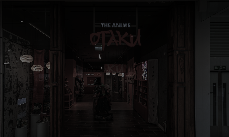
To establish the physical presence, the core visual identity was directly translated into the Westfield storefront to create an immersive, highly engaging destination.
Strategic Placement
Visual Anchors
The primary red hue boldly anchors the space, applied to the prominent checkout counter and display features to instantly capture passing shopper attention.
Dynamic Contrast
Immersive Atmosphere
Set against striking black and white manga wall wraps, the extruded 3D illuminated logo creates a brilliant focal point that perfectly highlights the merchandise.


Brand Assets
To populate the digital and physical canvas, a targeted visual strategy was developed that places the actual store inventory at the forefront.
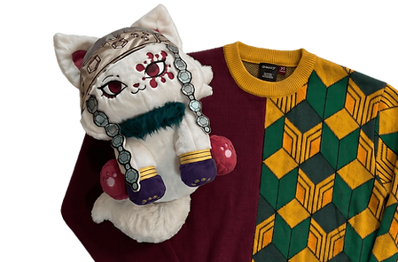
The Curated Collection
Styled arrangements of physical merchandise, including manga and apparel, directly tie the products into the core visual identity to actively entice store visits.
.png)
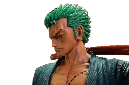
Immersive Features
High-quality images of life-size character statues and Japanese-inspired signage act as highly shareable visual anchors to maintain a consistent cultural aesthetic.
.png)
Logo Typography & Tone
The verbal identity relies on an energetic communication style, utilising typefaces that visually convey both raw artistic motion and robust structural strength.
"Otaku"
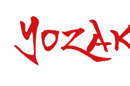
Yozakura
Chosen for the distinctive 'Otaku' script, this expressive brush-stroke typeface provides an authentic Japanese calligraphy presence, capturing the required raw artistic energy.
"The Anime"
Futura Extra Black
Selected for its geometric weight, this robust typeface balances the expressive script, delivering maximum high street visibility and ensuring the brand commands attention.

Strategic Execution
To build a cohesive identity, the project was executed in targeted phases, evolving a simple logo brief into a fully realised physical retail experience.
Phase 01
Strategic Foundation
The process began by establishing a vibrant colour palette and defining an authentic cultural aesthetic capable of cutting through the noise of Westfield.
Phase 03
Visual Ecosystem
A targeted asset strategy was developed, utilising styled physical merchandise and immersive store features to seamlessly bridge digital marketing with the physical shop.
Phase 02
Identity Design
A bespoke logotype was crafted, blending dynamic brush-stroke typography with robust structural weights to ensure maximum visibility and authentic cultural resonance.
Phase 04
Retail Application
The complete identity was translated directly into the storefront environment, creating an engaging destination with 3D illuminated signage and striking manga wall wraps.
The branding and visual identity shown here represent the final deliverables at the time of the project's completion. The live brand may look slightly different today as it continues to adapt and grow.