Ownership:
End-to-End
Released:
2021

Core Context
Objective
Modern Masculinity
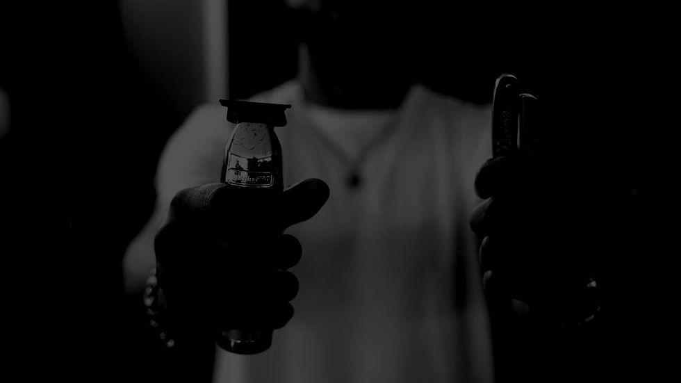
Creating a dark, refined environment that moves away from standard barbershop aesthetics to visually exude high-end luxury and modern masculinity.
Insight
Cohesive Application
Building a robust visual system that translates flawlessly across custom typography, bespoke physical merchandise, and prominent sports sponsorships.
Challenge
The Brand Icon
Elevating the client's initial concept into a striking professional icon, seamlessly incorporating a subtle human hairstyle into a powerful lion's mane.
Target Audience
Premium Clientele
Designing a recognisable brand presence specifically tailored to command attention and build trust with an exclusive demographic, including local professional athletes.
Brand Colours
Premium Dark Palette
A sophisticated palette anchored by primary black, contrasted with luxurious copper accents to convey high-end styling and ensure visual clarity across all mediums.
Primary Black
Hex: #000000
RGB: 0, 0, 0
Copper Gold
Hex: #FFAD86
RGB: 255, 173, 134
Striking Red
Hex: #F73939
RGB: 247, 57, 57
Pure White
Hex: #FFFFFF
RGB: 255, 255, 255
Identity & Logotype
A bold, recognisable emblem exuding modern masculinity and high-end luxury, combining a bespoke icon with customised typography to serve as a powerful brand centerpiece.
The Lion Icon
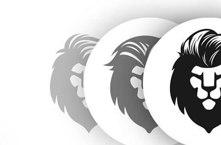
The lion's mane cleverly incorporates the subtle shape of a human hairstyle, instantly communicating the core styling service while maintaining a fierce, premium aesthetic.

Concept Iteration
Three distinct concepts focusing on mane variations were developed, culminating in a finalised icon made for maximum versatility and perfect legibility across all backgrounds.
Custom Wordmark
A foundational 'hand-written' typeface was sourced and customised with bespoke styling, ensuring the lettering uniquely complements the strong lion icon without competing.
.png)
The Outcome
A striking visual cornerstone that successfully positions Marshalls as a premium, modern styling destination for high-end clientele.


Background Creatives
To establish the visual canvas, professional in-store photography was treated with custom dark and light overlay effects, seamlessly unifying the imagery to guarantee maximum digital flexibility and typography legibility while maintaining a sophisticated, luxurious aesthetic.


Brand Assets
To bring the brand into the physical world, a comprehensive suite of custom applications was developed, seamlessly maintaining the luxurious aesthetic across all physical touchpoints.
Business Cards
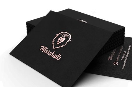
Premium matte black cardstock paired with a chrome rose gold print creates a tactile brand extension, ensuring the cards leave a lasting, high-end impression.
.png)
Logo Signage
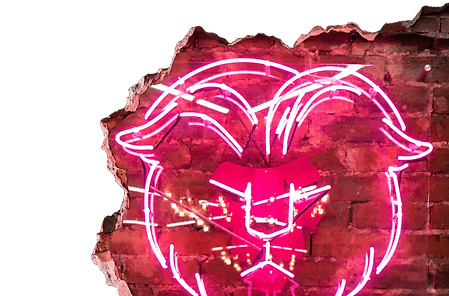
A bold custom neon sign installed against raw studio brickwork acts as a powerful, highly photogenic centerpiece that physically anchors the brand's modern aesthetic.
.png)
Product Designs
The identity seamlessly scales to bespoke styling creams, featuring sleek black containers and metallic copper lids that perfectly mirror the overarching premium aesthetic.
.png)
Sponsorship
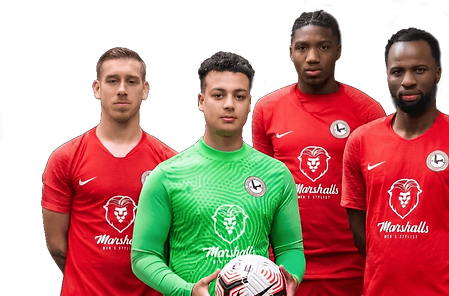
Prominently featured on the striking red kits of the Barnes Eagles Football Club, the logo demonstrates high visibility and versatility in real-world sports applications.
.png)
Logo Typography & Tone
The verbal identity relies on confident, refined communication, utilising typography that naturally conveys strength and sophistication to complement the custom wordmark.
Titles & Body
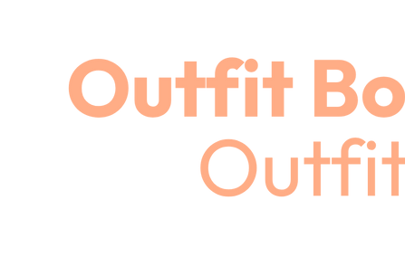
Outfit
Chosen for all headings and body copy, this clean, geometric sans-serif typeface brings undeniable modernism, ensuring a legible and premium finish across all marketing materials.
Brand Video
To elevate the digital experience, curated industry footage was merged with distinct overlay effects to create an immersive, bespoke brand video.
Atmospheric Immersion
Bespoke Aesthetic
The strategic visual treatment captures the luxurious and exclusive atmosphere of the shop, ensuring the moving imagery feels bespoke to the premium styling environment.
Digital Versatility
Dynamic Assets
Set against striking black and white manga wall wraps, the extruded 3D illuminated logo creates a brilliant focal point that perfectly highlights the merchandise.
Strategic Execution
To build a cohesive luxury identity, the project was executed in targeted phases, transforming a foundational concept into a premium lifestyle brand.
Phase 01
The Dark Canvas
The process began by establishing a premium dark colour palette contrasted with copper accents to define a luxurious, high-end visual language.
Phase 03
Digital Atmosphere
Custom digital overlays and an immersive brand video were developed to unify professional photography and establish a moody, sophisticated digital presence.
Phase 02
Forging the Emblem
A powerful brand icon and custom hand-written wordmark were crafted to instantly communicate modern masculinity and exclusive styling services.
Phase 04
Tangible Rollout
The overarching identity was translated into tangible touchpoints, including bespoke physical merchandise, striking neon signage, and local sports sponsorships.
The branding and visual identity shown here represent the final deliverables at the time of the project's completion. The live brand may look slightly different today as it continues to adapt and grow.