
Ownership:
End-to-End
Released:
2022

Core Context
Objective
High-Contrast Identity
Moving away from rustic, distressed aesthetics to create a sleek, high-contrast visual system that feels both premium and highly approachable.
Insight
Scalable Framework
Designing a versatile brand framework engineered to scale flawlessly from small, tangible packaging products to large-scale storefront signage.
Challenge
Iconic Synthesis
Visually embodying the literal meaning of the name by seamlessly integrating the silhouette of a home with a coffee bean to create a clever, instantly recognisable primary logo.
Target Audience
Local Prominence
Fostering community trust and quick brand recognition by creating a commanding visual identity that cuts through the visual noise of the Twickenham high street.
Brand Colours
Vibrant High-Contrast Palette
A bold, high-impact aesthetic rooted in deep black and crisp white, punctuated by vibrant orange hues to subtly communicate energy, warmth, and modern sophistication while standing out distinctly on the Twickenham high street.
Roasted Amber
Hex: #FBB040
RGB: 251, 176, 64
Espresso Core
Hex: #101301
RGB: 16, 19, 1
Porcelain White
Hex: #F73939
RGB: 251, 250, 247
Golden Brew
Hex: #FFDB00
RGB: 255, 219, 0
Identity & Logotype
A clean, highly scalable mark carrying genuine personality and modern professionalism, visually translating the name into a striking, balanced lockup that feels both premium and deeply approachable.
A Home for Coffee
The central icon cleverly merges the minimal silhouette of a house with a coffee bean, using thick, rounded strokes to provide a friendly yet solid visual anchor.

The Foundation Font
The wordmark leverages the architectural nature of Penumbra Sans Std, creating a structured typography that contrasts beautifully with the organic curves of the central icon.

Adaptable by Design
Engineered as a highly modular system, the elements can be seamlessly split apart, stacked, or kept together to ensure uncompromising brand recognition across all media.
The Outcome
A versatile visual cornerstone that successfully bridges the gap between a premium, modern aesthetic and the inviting warmth of an independent community coffee shop.


Background Creatives
A bespoke step-and-repeat pattern featuring playful coffee iconography was developed to establish a versatile visual canvas. This subtle texture adds essential depth to balance the rigid architectural typography, ensuring the brand communicates the genuine craft and inviting warmth of an independent café.


Assets & Packaging
By transforming physical products into primary brand assets through transparent photography of actual offerings, the brand establishes immediate trust and showcases the high-quality in-store experience.
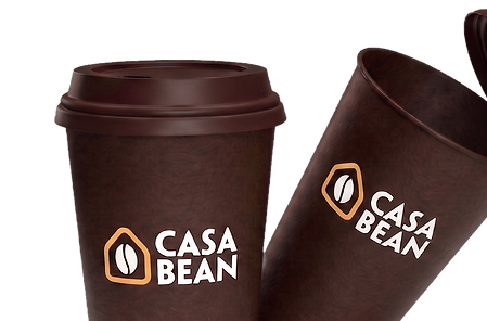
Acting as mobile billboards, the deep Espresso Core cups provide a striking contrast for the primary logo, ensuring high visibility among daily commuters.
.png)
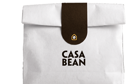
A crisp white base paired with a tailored sealing sticker allows the striking typography to take centre stage, communicating modern purity and premium quality.
.png)
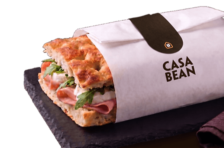
Showcasing fresh food in its final branded wrapping provides an honest representation of daily offerings, confidently highlighting quality without relying on deceptive styling.
.png)
Typography & Tone
By pairing architectural strength with modern warmth, the selected typography visually echoes the brand's confident tone, ensuring every written word makes a premium, authoritative statement.
Titles
Penumbra Sans Std
Chosen for all primary headings, this architectural typeface brings undeniable structure and a commanding presence, ensuring the brand always maintains a strong voice.

Body
Archivo
This versatile sans-serif offers a clean, highly legible reading experience that perfectly balances the bolder heading font, keeping the overall aesthetic sleek and contemporary.

Strategic Execution
To build a striking community hub, the project was executed in targeted phases, transforming a modern, high-contrast concept into an inviting and highly visible independent coffee brand.
Phase 01
High-Contrast Foundation
The process began by establishing a bold colour palette of deep black and crisp white, punctuated by vibrant orange to guarantee prominent high street visibility.
Phase 03
Textural Canvas
Bespoke step-and-repeat patterns featuring playful line-art illustrations were developed to add essential warmth and approachability to the structured visual system.
Phase 02
Architectural Identity
A clever central icon merging a home and coffee bean was crafted alongside structured typography to create a welcoming yet premium brand mark.
Phase 04
Tangible Application
The identity was flawlessly scaled into physical touchpoints, transforming takeaway cups and transparent bakery packaging into mobile brand assets for daily commuters.
The branding and visual identity shown here represent the final deliverables at the time of the project's completion. The live brand may look slightly different today as it continues to adapt and grow.