Ownership:
End-to-End
Released:
2022

Core Context
Objective
Premium Exclusivity
Establishing a high-end visual language that moves away from typical automotive tropes, ensuring customers feel part of an elite and unique community.
Insight
Accessible Luxury
Designing an intuitive and approachable brand presence that actively demonstrates genuine care for customer lifestyle needs while securely retaining its elite status.
Challenge
Client Collaboration
Working in close partnership with the client to elevate their strong initial concepts into a fully realised, cohesive brand identity within a crowded market.
Target Audience
Digital Cohesion
Building flexible templates for social media and website assets to ensure the high-end brand experience remains consistent and engaging across all online platforms.
Brand Colours
The Exclusive Palette
By selecting a bold primary red supported by deep dark tones and elegant yellow accents, the brand immediately commands attention within a highly competitive automotive market.
Dark Fire
Hex: #C1272D
RGB: 193, 39, 45
Coal
Hex: #1C202B
RGB: 28, 32, 43
Bright Star
Hex: #FFFF00
RGB: 255, 255, 0
Pure White
Hex: #FFFFFF
RGB: 255, 255, 255
Identity & Logotype
By developing a bespoke wordmark and custom icon instead of standard templates, the brand achieves a vibrant, modern mark balancing true luxury with approachability.
The Wordmark
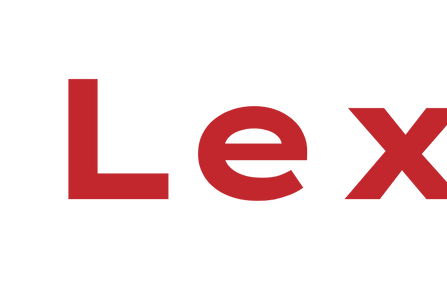
Utilising Lexend Peta as a foundation, a custom-engineered letter 'E' was introduced to inject a sharp, bespoke edge that aligns with the high-end vision.

The Gear Icon
A standard mechanical gear was heavily refined into a premium geometric pattern, elevating the graphic from its automotive roots into an elite, luxurious crest.

The Monogram Integration
The custom letter 'E' was carefully integrated directly into the gear's centre, linking the identity together to create a powerful, easily recognisable standalone mark.
.png)
The Outcome
By merging the bespoke wordmark with the refined monogram, the versatile and vibrant logo system successfully positions Exclusive Car Group as a truly elite industry presence.


Background Creatives
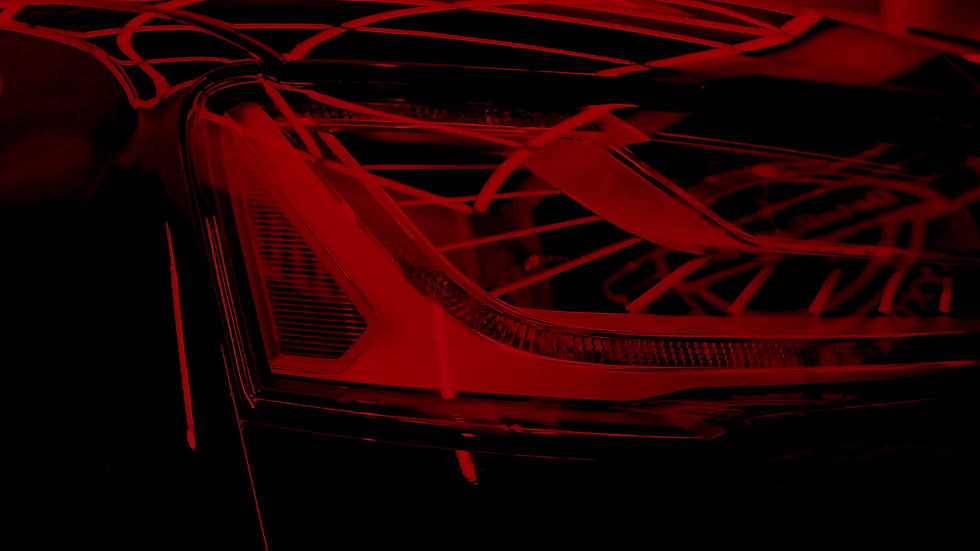
By applying strategic colour treatments to high-quality vehicle photography, the brand transforms standard automotive imagery into premium digital assets that consistently reinforce an elite, luxurious status.


Brand Assets
By establishing a distinct visual style through targeted website assets and social media templates, the brand ensures all promotional material feels exclusive, curated, and perfectly aligned with the luxury market.
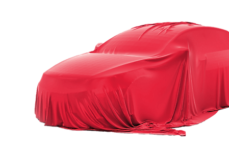
The Covered Collection
Curating images of vehicles concealed under sleek red covers generates intrigue and directly ties into the primary palette, creating a sense of anticipation for online advertisements.
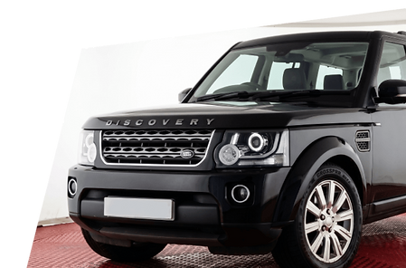
The Premium Showroom
Placing high-quality images of real inventory within bespoke social media templates ensures all promotional posts maintain a consistent aesthetic while focusing entirely on the elite cars.
.png)
Logo Typography & Tone
By selecting typefaces that convey modern luxury and strength, the brand visually supports its refined communication style, ensuring every written word feels exclusive and authoritative.
Titles
Lexend Peta
Chosen for all primary headings, this modern typeface provides a strong, commanding presence that perfectly matches the elite styling envisioned by the client.
.png)
Body
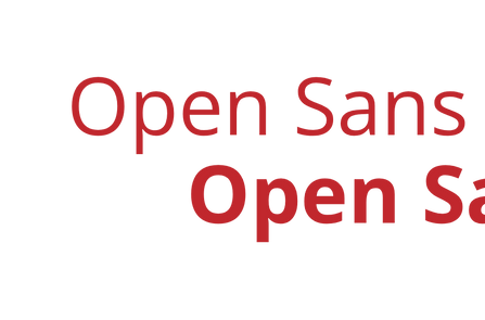
Open Sans
Utilised in Regular and Bold weights for all body text, this versatile typeface offers a clean, readable experience that balances the dominant headings with quiet confidence.
.png)
Brand Video
By merging premium vehicle footage with distinct red colour overlays, the brand creates a dynamic and immersive video experience that instantly captures the high-end energy and exclusive atmosphere of the dealership.
Functional Variations
Asset Versatility
To maximise digital versatility, the final video was produced in multiple functional variations, featuring options both with and without the integrated primary logo.
Seamless Deployment
Dynamic Application
This flexibility allows seamless deployment as an atmospheric background or a standalone promotional piece, ensuring a consistently luxurious and commanding brand presence.
Strategic Execution
By executing the project in targeted strategic phases, the brand successfully translates a strong initial client vision into a cohesive, elite automotive identity that effortlessly cuts through industry noise.
Phase 01
Bold Foundations
The process began by establishing a powerful primary red palette, supported by deep dark tones to immediately command attention and ground the luxurious aesthetic.
Phase 03
Curated Assets
trategic colour treatments, high-quality vehicle photography, and targeted social media templates were developed to ensure a consistent, high-end visual style.
Phase 02
Bespoke Identity
A custom-engineered wordmark and a refined geometric gear icon were seamlessly integrated, creating a versatile monogram that perfectly embodies premium exclusivity.
Phase 04
Immersive Expansion
Authoritative typography and dynamic brand video variations were implemented to elevate the digital experience, instantly capturing the exclusive atmosphere of the dealership.
The branding and visual identity shown here represent the final deliverables at the time of the project's completion. The live brand may look slightly different today as it continues to adapt and grow.