Ownership:
End-to-End
Released:
2026

Core Context
Objective
A Human Alternative
To craft a comprehensive brand identity for a mental healthcare provider, visually and verbally translating their mission of offering a calm, human-first sanctuary.
Insight
Internal Alignment
A cohesive brand system, anchored by a handbook for psychiatrists and operational staff, aligns the entire team to deliver a consistently smooth patient journey.
Challenge
Empathetic Compliance
Building a flexible framework that adheres to medical laws across India and future UK markets, ensuring regulatory compliance while avoiding cold healthcare tropes.
Target Audience
Seeking Clarity
Individuals navigating mental health challenges who need a gentle environment to find clarity, reached through honest, empathetic communication.
Brand Colours
Nature-Inspired Palette
To align with the mission of providing a calm sanctuary, this nature-inspired aesthetic evokes feelings of grounding, tranquillity, and organic growth. This deliberately moves away from the sterile, clinical tones typical of traditional healthcare environments.
Evergreen Dusk
Hex: #00404A
RGB: 0, 64, 74
Calm Depths
Hex: #11223D
RGB: 17, 34, 61
Pebble Bay
Hex: #EDE6D3
RGB: 237, 230, 211
Aloe Tint
Hex: #F4FAF9
RGB: 244, 250, 249
Identity & Logotype
Custom-designed from scratch to bridge clinical authority with genuine human warmth, avoiding sterile healthcare tropes in favour of an approachable visual anchor.
The Subtle Smile
The custom 'H' naturally integrates a subtle smile, adding immediate warmth and approachability without relying on overt or cliché medical graphics.

Fluid Typography
Hand-crafted lettering features smooth transitions between characters, removing harsh angles to visually mirror a seamless, stress-free patient journey.

The Standalone Mark
The smiling 'H' easily extracts as a distinct icon, maintaining high legibility whether scaled down for digital favicons or up for physical signage.

The Outcome
The final bespoke logotype, delivering an immediate sense of clarity, safety, and warmth.


Background Creatives
To establish the visual canvas for the brand, these distinct watercolour creatives intentionally avoid rigid, digital perfection. The naturally jagged edges and abstract patterns subtly echo serene mountainous landscapes, introducing a handcrafted, earthy aesthetic that visibly reinforces the commitment to a calm, human-first sanctuary.


Brand Assets
Custom, soft-toned illustrations were developed to communicate sensitive mental health topics with genuine warmth, replacing sterile medical diagrams with empathetic design.
Organic Textures
Building upon the watercolour canvas, these illustrations utilise a deeply textured, slightly grainy aesthetic to avoid cold digital perfection and reinforce approachability.
.png)
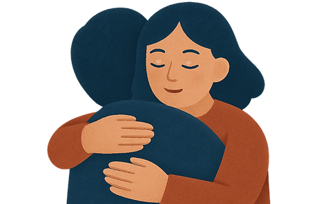
Empathetic Imagery
Navigating heavy subjects requires a delicate touch. Visuals are portrayed through an empathetic lens, using soft metaphors to ensure imagery remains consistently supportive.
.png)
AI Scalability
To allow rapid asset generation, a custom AI model was trained on the brand style, with every output undergoing rigorous human verification for clinical appropriateness.

AI Scalability
A custom AI model was deployed to accelerate asset generation, empowering teams to rapidly produce empathetic illustrations and backgrounds while maintaining visual consistency.
Custom Model Training
Visual Consistency
Trained directly on the brand's organic textures and nature-inspired palettes, the model allows teams to seamlessly scale the production of bespoke backgrounds and illustrations.
Human Verification
Clinical Appropriateness
Acting solely as a rapid support tool, every generated asset requires rigorous human review to guarantee maximum empathy and complete alignment with clinical standards.

Marketing Creatives
These creatives represent the final convergence of the identity, uniting custom typography, soothing backgrounds, and empathetic copy to create a soft, safe visual space.
Visual Convergence
Unified Messaging
Bespoke illustrations are meticulously crafted to connect directly with the highly empathetic copy, ensuring the visual language resonates instantly with the viewer.
Structural Versatility
Adaptable Layouts
Engineered to seamlessly adapt across print and digital formats, featuring a dedicated grounding wave to cleanly house necessary compliance text and contact information.


Typography & Tone
Happigo's verbal identity relies on honest, highly empathetic communication to establish a calm sanctuary. The typography pairs closely with this tone, ensuring every written word feels like a supportive conversation rather than a sterile medical report.
Titles
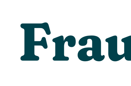
Fraunces SuperSoft
Chosen for all headings, this slightly rounded, tactile typeface introduces undeniable warmth, visually mirroring the brand’s core value of genuine compassion.
Body Text
Figtree
Offering a clean and uncluttered reading experience, this typeface delivers vital clinical insight with total clarity while maintaining an approachable, supportive feel.

Strategic Execution
To achieve the platform's core commercial goals, the project was strategically executed to seamlessly bridge a highly scalable technical architecture with a frictionless, conversion-driven UI
Phase 01
Strategic Foundation
Established the core brand strategy and nature-inspired colour palette, defining the emotional resonance and ensuring compliance for global healthcare markets.
Phase 03
Visual Ecosystem
Built a rich visual language featuring watercolour background creatives, textured illustrations, and scalable AI workflows for efficient asset generation.
Phase 02
Bespoke Logotype
Crafted custom typography from scratch, integrating a subtle smile into the 'H' and developing a fluid, highly versatile standalone brand mark.
Phase 04
Unified Application
Standardised the typography pairings and deployed fully adaptable marketing creatives designed to seamlessly bridge clinical authority with genuine empathy.
The branding and visual identity shown here represent the final deliverables at the time of the project's completion. The live brand may look slightly different today as it continues to adapt and grow.