
Offers Portal
Product Design Case Study
Ownership:
End-to-End & Integration
Released:
2024

The Results
Click-Out to Merchants
+28%
Average Dwell Time
+45%
Page Speed
98 / 100
Internal Page Setup
4x Faster
All statistics were accumulated as an average during the testing period.
Core Context
Objective
Multi-Brand Template
Engineer a versatile, white-label webpage template designed for seamless deployment across a diverse brand portfolio to effectively showcase curated promotional offers.
Insight
Operational Efficiency
Constructing a flexible internal framework drastically reduces page setup times, empowering the team to effortlessly modify content and deploy new campaigns significantly faster.
Challenge
Regulatory Friction
Transitioning away from traditional layouts to build a transparent, secure environment that adheres to complex industry regulations without sacrificing user readability.
User Scenario
Mobile-First Conversion
A polished, mobile-optimised experience establishes a clear visual hierarchy and integrates trust signals to naturally guide high-intent users directly toward merchant clickouts.
The Conversion Framework
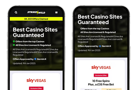
Engineered for maximum engagement, this highly optimised architecture functions flawlessly across all devices. The comprehensive framework guarantees strict visual uniformity while actively building user trust from the first interaction.
01 Dynamic Offer Cards
Crafted to present key promotions with absolute clarity, these modular cards ensure users quickly digest complex details. The layout prioritises straightforward readability and crucial transparency to build immediate trust.

02 Trust-Driven Headers
Designed to establish credibility instantly, this primary touchpoint integrates prominent security icons and compliance details. Strategic SEO enhancements and unique selling points actively boost user confidence.
.png)
03 Expanded Content Hub
Strategically expanded to improve organic rankings, this dedicated hub includes comprehensive FAQs, testimonials, and game areas. These elements boost on-page dwell time while leveraging social proof to establish undeniable trust.

Offer Card Architecture
Designed to balance promotional excitement with strict regulatory compliance, this modular layout removes visual friction, presenting complex merchant data in an easily digestible format to drive high-volume clickouts.
01 Merchant & Offer Clarity
A clear visual hierarchy naturally guides the user's eye directly to critical promotional information. High-quality logos and generous spacing ensure immediate brand recognition, allowing users to scan deals effortlessly.

02 Transparent Data Elements
To build trust, crucial details like minimum deposit amounts and wagering rules are isolated into distinct, colour-coded data pills. Bespoke USP badges highlight unique brand value, capturing attention without cluttering the core promotional message.

03 Integrated Social Proof
A dedicated credibility strip sits right above the regulatory terms within the core UI. Displaying verification badges, ratings, and game counts in a minimal format provides immediate reassurance exactly when a user decides to click.

The Outcome
Delivered a highly scalable, conversion-driven framework that transformed standard promotions into an engaging engine, successfully achieving a 28% increase in merchant clickouts while cutting internal page setup speeds in half.


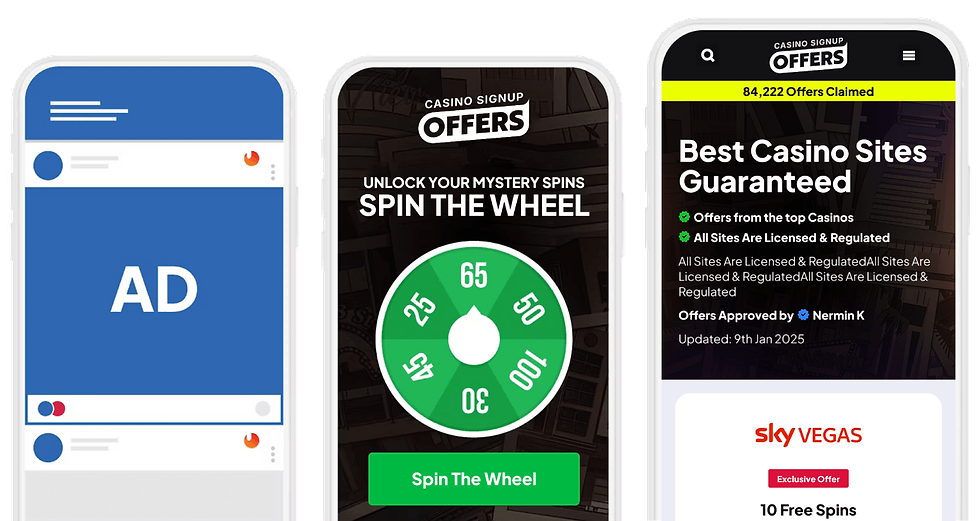
User Journey
The user journey operates as a seamless, three-step funnel designed to capture attention, secure data, and ultimately turn engaged traffic into tangible merchant clickouts.
01 The Trigger
External Advertisement
The journey initiates off-site with an external advertisement, successfully driving high-intent, targeted traffic directly into the primary conversion funnel.
02 The Engagement
Interactive Landing Page
Upon clicking the ad, users enter a highly optimised data-capture environment. Interactive features like gamification successfully secure user details and build initial momentum.
03 The Conversion
Final Offers Portal
Acting as the definitive final destination, this lightning-fast, trust-driven page allows users to evaluate curated deals, select their desired brand, and complete the transaction.
(1).png)
Template Strategy
Created to build user trust and elevate platform performance, the core strategy focused on streamlining the visual layout and recommending lightweight technical elements to protect ad spend and prevent funnel drop-offs.
Page Speed
64 ➔ 98
Streamlined visual layouts with lightweight, SEO-friendly technical elements to directly boost rankings.
Setup Time
6h ➔ 1.5h
Built a flexible internal framework to successfully remove technical bottlenecks and drastically accelerate deployment.
Typography & Iconography
Designed for absolute clarity, the visual foundation balances complex promotional data with strict regulatory terms, establishing a highly legible baseline that naturally supports frictionless user conversions.
Typography
Plus Jakarta Sans
Plus Jakarta Sans anchors the visual hierarchy for all headings and body copy, ensuring exciting promotional offers and mandatory compliance details remain exceptionally clean and readable across all screens.

Iconography
Google Material Icons
Universally recognised Google icons are integrated throughout the design to communicate security and direct user actions, acting as a familiar visual shorthand to instantly reinforce trust and actively guide navigation.

UI Colours
Core Palette
Built around proven psychological signals rather than aesthetic choices, these traditional UI colours direct user attention to critical actions, removing visual friction to seamlessly drive high-volume multi-brand conversions.
Action Green
Hex: #18B752
RGB: 24, 183, 82
Trust Blue
Hex: #007AFF
RGB: 0, 122, 255
Highlight Red
Hex: #C02A29
RGB: 192, 42, 41
Soft Gold
Hex: #FCE3A1
RGB: 252, 227, 161
Strategic Execution
To deliver a highly scalable white-label solution, the project was strategically executed from a foundational trust strategy through to the deployment of modular, high-converting offer components
Phase 01
Trust Architecture
Established a secure webpage foundation by integrating historical claim data and vital compliance credentials to instantly build user confidence upon arrival.
Phase 03
Merchant Integration
Integrated high-quality logos, brand-specific colour accents, and dedicated USP sections into every module to effectively highlight individual merchant value.
Phase 02
Component Modularity
Developed clear, white-label offer modules with distinct merchant separation, ensuring the primary welcome deal always commands immediate user attention.
Phase 04
Content Expansion
Expanded the core page architecture to include comprehensive FAQs and user testimonials, significantly boosting organic SEO value and overall user engagement.
Multi-Brand Scalability
Deployed across a diverse portfolio of white-label brands.


Please note that the offers and pricing shown in these designs are for conceptual and illustrative purposes only. They were included to demonstrate the visual layout and may not reflect the brand's current rates or active marketing campaigns.