
Quantum Media
Product Design Case Study
Ownership:
End-to-End & Build
Released:
2026

The Results
SEO Score
100 / 100
Cadidate Surge
x2 Surge
All statistics were accumulated as an average during the testing period.
Core Context
Objective
Brand Evolution
Execute a complete overhaul of the existing corporate website to launch quantum.media, successfully aligning the digital experience with their refreshed brand identity.
Insight
Dual-Focus Strategy
To support significant internal growth, the platform needed to simultaneously expand the affiliate programme and develop a dedicated mass hiring hub.
Challenge
Rigid Brand Perception
Transitioning away from an outdated, highly corporate feel to inject authentic personality, ensuring the new platform clearly communicates the company's history and industry successes.
User Scenario
High-Value Engagement
A relatable, human-centred interface builds immediate trust, effectively guiding top-tier talent and prospective partners directly into high-quality onboarding conversations.
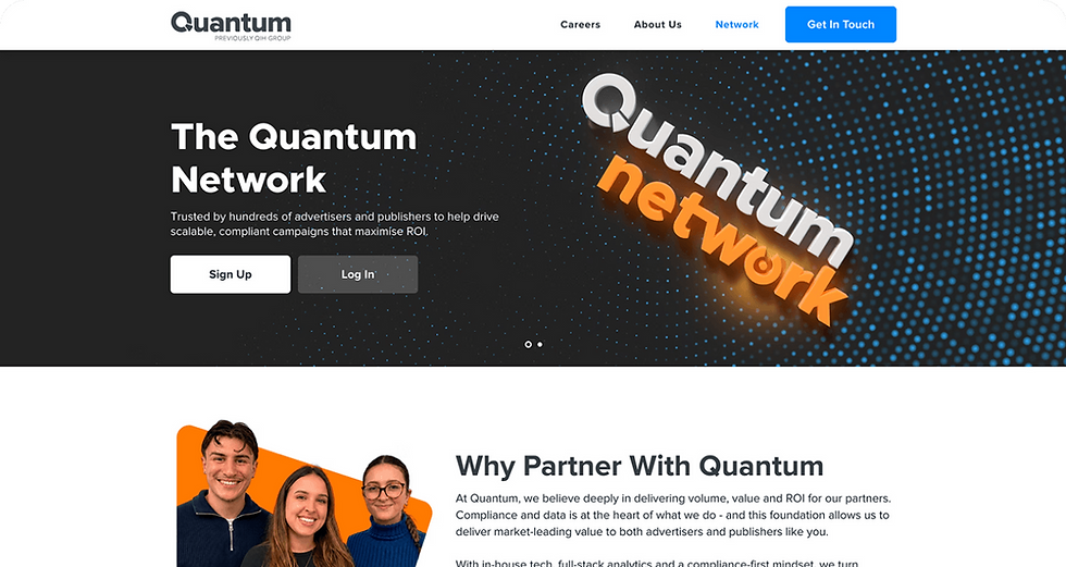
The Quantum Network
Designed to attract premium affiliates, this dedicated hub was equipped with highly targeted features to elevate the programme's digital footprint and successfully drive high-value partnerships.
01 Partner Growth
Built a highly focused section combining strategic layouts with clear calls to action. Highlighting scalable revenue and competitive commission structures actively drives a high volume of premium affiliate sign-ups.
.png)
02 The Team
Introduced a personalised element to directly showcase the dedicated account managers behind the programme. Putting a human face to the brand builds immediate connections and provides reassurance of ongoing support.
.png)
03 Establishing Trust
Dedicated a foundational area to transparently showcase the brand's extensive operational history. Presenting a proven track record builds robust market credibility and establishes unwavering trust with prospective partners.
.png)
04 News & Updates
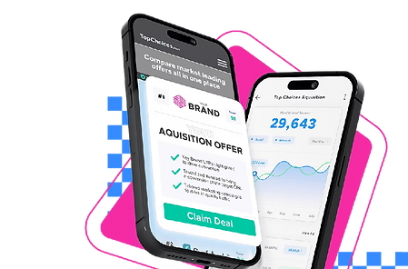
Integrated a dynamic widget to constantly display the latest high-converting offers and platform updates. Keeping partners informed with relevant content ensures maximum active engagement and encourages frequent return visits.
.png)
.png)
The Careers Page
Designed a comprehensive careers hub equipped with targeted features to showcase the company culture and successfully support an upcoming mass hiring initiative.
01 Industry Awards
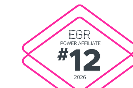
Strategically highlighted recent accolades and industry-won awards to instantly build market credibility. Showcasing established success acts as a powerful magnet to attract highly driven, top-tier talent.
.png)
02 Core Values
Utilised interactive image reveals to thoughtfully showcase the company's mission and core beliefs. This engaging approach ensures clear alignment of expectations before candidates even begin the application process.
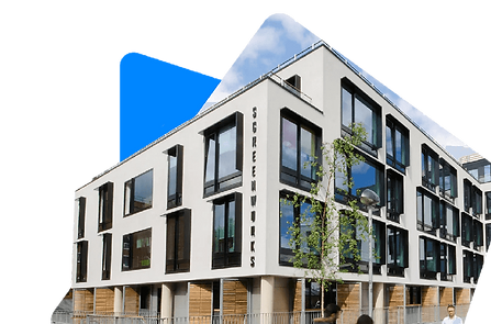
03 Company Life
Created a highly visual section highlighting real colleagues, team events, and daily office operations. Providing an authentic look into the vibrant workplace culture humanises the brand and helps candidates envision themselves thriving there.
.png)
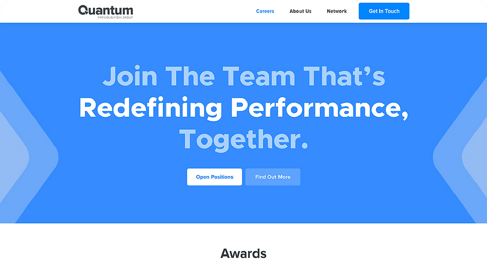
04 Native Job Board
Integrated a seamless native widget to display up-to-date roles directly on the page. Removing third-party redirects drastically simplifies the application journey and significantly streamlines the internal hiring pipeline.

.png)
Everything Else
Redesigned the remaining core pages, equipping them with targeted features to elevate the agency's overall digital presence and support primary business objectives.
Brand Identity
Performance Mindset
esigned a high-impact homepage section highlighting industry insights and a performance-first mindset, structured to capture immediate visitor attention from the very first click.
Data & Tech
In-House Analytics
Built a detailed section highlighting in-house technology and full-stack analytics to clearly demonstrate market leadership and actively drive long-term partner confidence.
About Us
Company History
Created a dedicated page showcasing a decade of experience, core missions, and milestones to effectively establish robust brand authority and unwavering market trust.
Core Services
Marketing Solutions
Structured a focused section detailing specialised marketing services to clearly communicate core platform offerings and successfully attract high-value prospective partners.
.png)
Typography & Tone
Engineered for ultimate flexibility, the visual foundation balances high-impact promotional messaging with maximum legibility, establishing a universal baseline that seamlessly adapts to multiple brand identities.
Titles
QuantumX
Utilised for all primary headings to create a distinct visual identity. Built entirely from scratch, this custom typeface injects unique personality, ensuring the platform stands out in a rigid corporate landscape.
.png)
Body
Proxima Nova
Selected for all secondary headings and general body text. This modern sans-serif perfectly complements the custom title font, providing an exceptionally clean and legible reading experience for complex corporate information.
.png)
UI Colours
Core Palette
Engineered to replace a rigid corporate feel, this high-contrast palette injects authentic personality into the digital experience. The vibrant hues balance professional authority with dynamic innovation, ensuring primary calls-to-action stand out effortlessly.
Quantum Blue
Hex: #297BFF
RGB: 41, 123, 255
Electric Green
Hex: #35DE64
RGB: 53, 222, 100
Network Orange
Hex: #FF7B00
RGB: 255, 123, 0
Deep Slate
Hex: #262628
RGB: 38, 38, 40
Strategic Execution
To ensure the redesign hit every business objective, the project was strategically executed from initial market discovery through to the final deployment of a streamlined, self-sufficient digital ecosystem.
Phase 01
Market Discovery
Analysed over 20 competitor corporate sites to establish core industry benchmarks and identify best practices, ensuring the new digital footprint stood out within the landscape.
Phase 03
Platform Independence
Executed a strategic build natively within Wix, empowering the team to easily manage ongoing site maintenance and make rapid updates without relying on external developers.
Phase 02
Stakeholder Alignment
Conducted detailed interviews with internal teams to pinpoint precise platform requirements, working closely with the CEO to guarantee strategic alignment across all business objectives.
Phase 04
Ecosystem Integration
Removed unnecessary third-party integrations to drastically reduce user friction, migrating external elements like affiliate onboarding forms into a seamless, native platform experience.
Please note that any statistics, team details, or performance metrics shown in these designs are for illustrative purposes to demonstrate the structural layout. They may not reflect the company's real-time data or active corporate initiatives.