top of page
BG-1.png

Silvan's

Arrow-Down.gif

The Outcome

Key Metrics

Reservations

+300%

Enquiries

+200%

Page Speed

93/100

SEO Score

92/100

All statistics were accumulated as an average during the testing period.

Project Goals

The objective of this project was to architect and launch a dedicated digital hub for Silvan's Restaurant. Evolving from a popular food truck reliant solely on a third-party social profile, the client required a robust, independent platform. The primary aim was to engineer a captivating environment that transitions loyal followers and new diners from casual browsing to confirmed bookings, establishing a strong foundational brand presence for the new restaurant.

Built strictly with a modern, mobile-first philosophy, the project focused heavily on simplifying the customer journey and achieving exceptional load speeds. The goal was to deliver an intuitive, visually engaging experience that naturally encourages visitors to explore the Mediterranean and Middle-Eastern menu, submit enquiries, and seamlessly make reservations across any device.

  • Spearhead the Restaurant Launch: Transition the brand from a mobile food truck reliant on social media to a fully owned digital platform, perfectly synchronised to support the launch of their brick-and-mortar restaurant.

  • Maximise Reservation Conversions: Architect the user interface to prominently feature clear, frictionless booking pathways throughout the site, directly driving table reservations for the newly opened venue.

  • Adopt a Mobile-First Approach: Develop the layout specifically for the dominant mobile user base, ensuring that browsing menus, checking availability, and booking tables is effortless and consistent across all devices.

  • Engineer for Maximum Speed: Construct a lightweight, streamlined site structure designed to deliver near-instant page load times, maintaining user engagement and preventing mobile bounce rates.

  • Streamline Content & Media: Create a highly visual, easy-to-navigate menu system that effectively showcases the dishes, making it simple for users to evaluate their options and find essential contact details.

Homepage & User Journey

Unlike standard, multi-page restaurant websites, Silvan's homepage was designed as a comprehensive central hub. The core concept was to make every essential action available immediately without forcing users to dig through complex navigation. By surfacing contact details, reservation systems, and key information directly on the homepage, the design allows users to find exactly what they need instantly.

1. Hero Conversions

Because many visitors arrive with a specific goal in mind, the top of the page prioritises immediate action. The hero section uses immersive culinary imagery to set the tone, paired with prominent call-to-action buttons for booking a table and viewing the menu. This layout ensures high-intent users are only ever one click away from completing their primary objective.

Home-1.png

2. Social Proof & Trust

Transitioning from a popular food truck to a new permanent venue required building immediate confidence with both new and returning diners. To achieve this, a dedicated "What Customers Say" module was integrated into the homepage flow. Displaying real, positive feedback directly alongside the core brand messaging provides instant social proof, validating the restaurant's quality and encouraging visitors to secure a booking.

Home-2.png

3. Essential Information

The lower sections of the homepage function purely as a practical utility hub. Rather than hiding important details on separate subpages, all essential information is presented on a single scroll. By clearly displaying direct contact options, an interactive location map, and details regarding private food van hire, the design ensures users can easily find the restaurant or reach out with specific enquiries without ever leaving the homepage.

Home-3.png
Homepage(1).png

Reservations & User Flow

Replacing manual social media messages with a fully automated, frictionless booking funnel was the primary driver behind the 300% increase in reservations. The architecture focuses on reducing the cognitive load required to complete a booking, ensuring that the interface naturally guides high-intent users from initial selection to final confirmation without any frustrating barriers.

1. Frictionless Booking

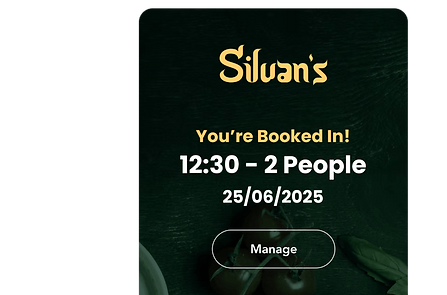
Designing the on-site reservation widget prioritised absolute speed and simplicity. By utilising large, thumb-friendly dropdowns for party sizes, dates, and times, the UI eliminates cumbersome typing and unnecessary form fields. This streamlined data capture directly reduces abandonment rates, allowing users to effortlessly secure their table in a matter of seconds.

Booking-1.png

2. Automated Confirmation

The user journey does not end when they leave the website. To solidify trust and actively reduce costly restaurant no-shows, a fully automated email confirmation system was integrated. Instantly delivering clear booking details directly to the user's inbox provides immediate reassurance and elevates the perceived professionalism of the brand, beautifully bridging the digital experience with the physical dining event.

Booking-2(1).png
Booking(1).png

Development & CMS Integration

While delivering a premium user-facing experience was paramount, the backend architecture needed to be equally intuitive for the restaurant's team. I took full ownership of the end-to-end process, transitioning the project from initial conceptual designs through to the final live build. The ultimate goal was to hand over a dynamic, self-sustaining platform that the staff could manage independently without requiring ongoing technical support.

  • End-to-End Execution: The entire platform was designed and developed from the ground up as a solo endeavour. This streamlined approach ensured that the initial strategic vision and high-fidelity visuals were perfectly preserved throughout the build phase, resulting in a cohesive, high-performance final product.

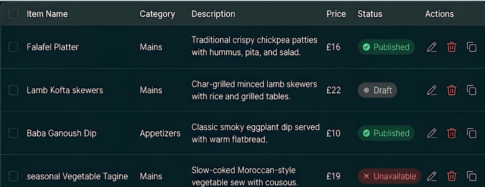
  • Intuitive Content Management: To ensure the website remains a living digital asset, a highly user-friendly backend interface was integrated. This system securely untethers the structural design from the content, allowing the business owner to easily log in and refresh the site's imagery and text formatting.

  • Dynamic Menu Control: For a thriving restaurant, the ability to instantly update seasonal dishes and adjust pricing is absolutely critical. The architecture features a dedicated menu management module, ensuring non-technical staff can rapidly publish new specials or amend dietary information without risking the integrity of the live layout.

  • Long-Term Staff Empowerment: By handing over a fully controllable environment, the project drastically reduces ongoing maintenance costs for the business. The staff now have complete autonomy to upload fresh culinary photography and adjust promotional banners, keeping the digital hub as fresh and inviting as the new physical restaurant.

CMS(1).png

Typography & Iconography

The platform's visual language was crafted to evoke the warmth and authenticity of the dining experience while maintaining exceptional digital usability. Because the site must effortlessly guide users through varied menu options and reservation steps, every design decision prioritised reducing cognitive load. The primary goal was to establish a highly legible and inviting aesthetic that naturally encourages exploration and supports frictionless conversions.

Titles & Body

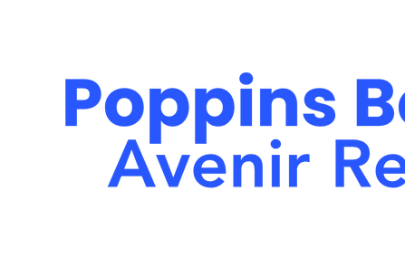
Poppins & Avenir

A strict dual-typeface approach anchors the visual hierarchy. Poppins is used for all primary headings, offering a welcoming, geometric structure that reflects the restaurant's friendly atmosphere. For body copy, Avenir ensures that intricate dish descriptions and dietary details remain exceptionally clean and easy to read across all screen sizes.

Font-1.png

Iconography

Custom Made

Moving away from generic vectors, a suite of custom iconography was designed to elevate the platform's visual presence. Inspired by traditional geometric patterns, these bespoke assets align perfectly with the restaurant's Mediterranean and Middle-Eastern roots. They seamlessly reinforce the core brand identity while maintaining a premium, uncluttered interface.

Font-2.png

UI Colours

Core Palette

To perfectly capture the authentic Mediterranean and Middle-Eastern dining experience without compromising digital performance, the UI colour palette was built around organic, high-contrast tones. Moving away from standard, sterile restaurant templates, the design pairs deep, earthy greens with a warm, highly visible accent colour. This strategic combination establishes a premium atmosphere while ensuring that essential navigational elements stand out immediately to the user.

By implementing this refined, nature-inspired approach, the interface naturally guides the user's journey. The rich Deep Forest tones provide a grounded base for primary headings and secondary utility buttons, reflecting the freshness of the restaurant's ingredients. Clean White is utilised extensively across the lower sections, pairing perfectly with the high-contrast Charcoal Black body text to ensure dense menu information and contact details remain exceptionally legible and easy to scan.

Most importantly, the ultra-warm Saffron Gold is strategically reserved strictly for primary conversions. By limiting its use to core interactive elements, such as the hero section's 'Book a Table' button, it creates a stark visual hierarchy. This completely removes digital friction, naturally funnelling high-intent visitors toward securing a reservation with absolute clarity.

The Blueprint

1. Strategy & Architecture

The design process began by evaluating the operational needs of the new physical restaurant alongside the expectations of their existing food truck customer base. The primary objective was to build a digital foundation that actively drives footfall.

Brand Transition Strategy

  • Audited previous social media interactions to identify the most common customer enquiries and operational friction points.

  • Mapped out a streamlined digital architecture specifically designed to drive immediate table reservations and clearly showcase the new menu.

UX Conceptualisation

  • Sketched layout structures that prominently feature high-intent actions, ensuring users can book a table in just a few clicks.

  • Iterated on the navigation flow to guarantee quick access to essential location and contact details for local diners on the move.

2. UI Execution & Handoff

Once the core user flow was established, the focus shifted to crafting a highly tactile, mobile-optimised interface that the restaurant staff could easily manage and maintain independently.

Mobile-First Interface

  • Prioritised the mobile layout, ensuring that exploring the menu and checking table availability feels completely intuitive on all smartphone devices.

  • Optimised interactive elements, such as the booking widget drop-downs, to eliminate frustrating typing requirements on smaller screens.

Scalable Content Management

  • Engineered flexible, reusable UI components mapped directly to a user-friendly backend system.

  • Structured the digital environment so non-technical staff can rapidly update seasonal dishes, adjust pricing, and manage private hire requests without disrupting the visual integrity of the site.

Please note that the offers and pricing shown in these designs are for conceptual and illustrative purposes only. They were included to demonstrate the visual layout and may not reflect the brand's current rates or active marketing campaigns.

bottom of page