
Email Templates

The Outcome
Key Metrics
Deliverability Rate
+55%
Open Rate
+22%
Click-Through Rate
+15%
HTML File Reduction
-66%
All statistics were accumulated as an average during the testing period.
Project Goals
The goal of this project was to execute a complete overhaul of our Email Template Suite, establishing a highly scalable and adaptable CRM design system. The primary objective was to create a unified master suite capable of covering all marketing communications, from automated welcome journeys to dynamic promotional campaigns.
By designing a modular architecture that seamlessly adapts across a diverse portfolio of white-label brands, the project aimed to eliminate design fragmentation. Furthermore, by migrating the structural framework to a dedicated email system (Stripo), the ultimate aim was to lock in brand consistency, streamline internal workflows, and future-proof the templates against the need for constant manual coding updates.
-
Establish a Master Template Suite: Design a comprehensive, highly adaptable set of email templates to support all marketing communications, including bespoke events, newsletters, and user journeys.
-
Ensure White-Label Scalability: Develop a modular, brand-agnostic design architecture that seamlessly adapts to the unique visual identities of multiple white-label brands without breaking structural integrity.
-
Implement a Centralised System: Integrate the new designs into Stripo to create a unified structural foundation, ensuring strict visual consistency and eliminating the need for complex future template updates.
-
Streamline Operational Workflows: Empower the marketing and CRM teams with highly flexible, ready-to-use modules that drastically reduce campaign creation times and remove technical bottlenecks.
-
Elevate the Inbox Experience: Standardise visual hierarchies, optimise mobile responsiveness, and clarify calls-to-action to improve email readability, boost click-through rates, and drive conversions directly from the inbox.
Template Strategy
Before visual execution, the core strategy required identifying the most effective conversion methods. A versatile suite of four unique landing page templates was decided upon to address the diverse requirements of multiple brands. Each layout targets different user behaviours, with individual features specifically tailored to a distinct audience and purpose. Establishing these four pillars ensures maximum adaptability and a structural solution ready for any campaign goal.
Template Reduction
11 → 5
Campaign Build Time
1d → 2h
The Master Suite
To ensure absolute consistency across all marketing communications, a centralised, overarching email design system was developed from the ground up. The execution encompassed the complete end-to-end design of both the foundational modular components and the final, ready-to-use templates.
This comprehensive suite was constructed to function flawlessly across all marketing channels and events. By migrating this unified framework into Stripo, the system guarantees strict visual uniformity across the entire portfolio of white-label brands while completely future-proofing the workflow against ongoing manual updates.
1. Events
Designed to spotlight high-profile sporting events and exclusive promotional offers, this template provides a dynamic visual structure to drive user engagement. Strategic asset placements were engineered to seamlessly house rich imagery, such as athletes and team uniforms, ensuring the layout remains fully adaptable for any major campaign across the broader sports and entertainment sectors.
.png)
2. Welcome Journey
Crafted to establish immediate trust and transparency, this template serves as the foundational touchpoint for new customers. The layout is structured to deliver a welcoming, comprehensive introduction to the brand's core offerings and overall identity. To further solidify credibility from the very first interaction, dedicated modules were strategically integrated to clearly display key USPs alongside essential compliance information.
.png)
3. Promotional (Standard)
As the suite's most utilised template, this layout was strategically engineered to highlight daily offers with maximum operational efficiency. By overlaying dynamic HTML text onto supplied background imagery, the CRM team can rapidly deploy updates without ongoing design support. To maximise retention, a supplementary section displays alternative options, capturing engagement if the primary promotion does not resonate.
.png)
4. Promotional (Campaign)
Built upon the standard promotional framework, this template was designed to elevate major seasonal campaigns like Black Friday or the Euros. By implementing a full-length themed background and a transparent header overlay for bespoke promotional text, the highly stylised design effectively prevents visual fatigue. This immersive approach ensures users remain engaged while powerfully pushing targeted, high-value seasonal offers.
.png)
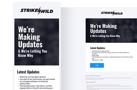
5. Newsletter / Compliance
Designed strictly for operational transparency, this text-based template ensures users are promptly informed about critical site or account updates. By utilising a clean, brand-themed background overlaid with adaptable HTML text, the framework empowers both the compliance and marketing teams to author and distribute essential communications independently, removing the need for ongoing design or technical support.
.png)
The Outcome
The deployment of the master email suite fundamentally transformed the internal workflow, successfully unifying all marketing communications across the white-label portfolio. By migrating the modular framework into Stripo, the CRM and marketing teams were empowered to construct and launch daily campaigns entirely independently. This shift eliminated previous design bottlenecks and drastically reduced overall campaign turnaround times.
Beyond operational efficiency, the architectural overhaul delivered immediate technical and performance improvements. The highly optimised HTML structure resulted in templates that were 66% lighter than their predecessors. This critical reduction in file weight secured higher inbox deliverability which, paired with a refined user experience and strategic layouts, ultimately drove significant increases in open rates and overall click-through engagement.
Visual Architecture
A core challenge of this project was balancing two distinct design needs: establishing a highly adaptable system for multiple white-label brands while making complex, data-heavy betting offers instantly digestible. By focusing heavily on strong visual hierarchy and a brand-agnostic foundation, I designed a layout where both the unique brand identity and the granular promotional details shine clearly, entirely removing visual clutter for the user.
Brand Foundation
I developed a neutral structural baseline allowing logos, typography, and colour palettes to be seamlessly swapped. This adaptable approach effortlessly scales across the portfolio, maintaining visual consistency without requiring manual layout tweaks.
.png)
Strategic Hierarchy
Casino and sports offers are notoriously heavy on numbers and odds. I utilised precise spacing, visual weight, and typographic scaling to guide the user’s eye straight to the core value and primary CTA, significantly reducing cognitive load.
.png)
Dynamic Theming
To ensure the templates never felt generic, the image-to-text ratios and overlay containers were expertly balanced. This accommodates rich, brand-specific imagery and themed backgrounds while keeping the HTML promotional copy highly legible.
.png)
Refined Compliance
Essential terms and conditions, alongside responsible gambling information, were integrated using discreet design techniques. This ensures strict legal compliance while keeping the main promotional area clean, premium, and uncluttered.
.png)
The Outcome
Ultimately, this design approach helped balance operational efficiency with a high-quality user experience. By building a flexible foundation and establishing a clear visual hierarchy, the new system ensures that launching campaigns across multiple brands doesn't mean compromising on readability or design standards.
Now, regardless of the specific brand, users receive clean, straightforward emails that clearly communicate the offer's value. By reducing visual clutter and naturally guiding the reader's attention, the updated layouts help support higher click-through rates while providing a more polished, cohesive feel across the entire network.
Future-Proofing A/B Testing
A major goal of this project was to make future A/B testing as effortless and transparent as possible. By stripping away the clutter and personally developing a focused set of updated test modules and templates, I established a clean, consistent baseline. This approach made it incredibly easy to track exactly what was being changed and clearly see how those specific updates directly impacted the data.
Template Consolidation
Instead of relying on dozens of fragmented layouts, I condensed everything into one streamlined master suite. This reduced complexity makes it significantly easier to manage active tests and accurately track overall user engagement.
Consistent Baseline
By ensuring strict visual uniformity across the newly updated templates, I eliminated the usual guesswork. Tests now yield highly accurate data because we are measuring specific module changes rather than battling inconsistent background designs.
Modular Experimentation
Because the entire system was based around interchangeable modules, the team can quickly swap and test individual modules (like a new CTA or hero image) to see what performs best without needing to rebuild the whole email.
Clear Data Tracking
With a tightly controlled suite of modules, following exactly what is being updated in each test is finally straightforward. This clarity guarantees that the resulting performance data provides an immediate, undeniable picture of what drives results.
The Outcome
The implementation of this modular testing framework completely transformed the way we approached email experimentation. By clearing out the template bloat and introducing the dedicated test modules I developed, we eliminated the friction that previously slowed down A/B testing. The marketing team now has a unified, easy-to-manage system where setting up a test is as simple as swapping a component, dramatically accelerating the entire optimisation cycle.
Ultimately, this newfound consistency shifted our testing strategy from educated guesswork to a highly accurate, data-driven process. Because it is now incredibly clear exactly which module is being updated, the resulting performance data is pristine and unambiguous. This clarity empowers the team to make confident, measurable improvements across all campaigns, knowing exactly what truly drives user engagement.
Typography & Palette
To support a highly adaptable, multi-brand email system, the visual foundation needed to balance strong promotional impact with ultimate flexibility. The overarching goal was to establish a universal baseline that ensures maximum legibility across all devices, while allowing the unique identity of each individual brand to shine through effortlessly without breaking the layout.
Typography
Oswald Bold & Helvetica
Oswald Bold was selected for primary headings. Its condensed, bold aesthetic delivers high-impact messaging while remaining space-efficient on mobile screens. To balance the heavy titles, Helvetica was implemented for all body copy, providing a clean, readable experience for complex offer details and compliance text.
.png)
Brand Palettes
Dynamic Theming
Since the master suite serves a diverse white-label portfolio, a single static colourway was not viable. Instead, the modular architecture seamlessly applies brand-specific colours across all templates. This dynamic approach ensures every campaign feels authentic to its brand while maintaining the system's structural integrity.
.png)
The Blueprint
1. System Audit & Planning
Before writing a single line of code, the project began with a rigorous teardown of the existing, fragmented setup to build a clear roadmap for the new architecture.
Legacy Teardown
-
Audited the sprawling library of existing templates to identify structural bottlenecks and pinpoint heavy, redundant code.
-
Collaborated directly with the CRM and compliance teams to map out the exact daily requirements needed for a unified master suite.
Modular Blueprinting
-
Categorised every necessary email element into a defined list of reusable, independent design blocks.
-
Established strict structural guidelines to ensure that any combination of these modules would stitch together flawlessly without breaking the layout.
2. Build & Deployment
With the blueprint finalised, the focus shifted to translating the new architecture into a lightweight, platform-ready system that the marketing and CRM team could immediately adopt.
Stripo Integration
-
Engineered the new modular blocks entirely within Stripo, tailoring the code specifically to support their drag-and-drop ecosystem.
-
Safeguarded the underlying HTML so teams could independently build and edit daily campaigns without accidentally altering the core design framework.
Testing & QA
-
Run rigorous cross-device and dark mode testing to ensure the HTML text overlays and brand assets are rendered perfectly across all major email clients.
-
Executed a phased rollout of the new templates, closely monitoring the initial live campaigns to confirm the targeted 66% reduction in file weight.
Multi-Brand Scalability
I designed these templates with a core focus on a multi-brand rollout strategy. The primary objective was to drastically streamline the workflow for both design and CRM teams, allowing them to rapidly generate, customise, and integrate new marketing assets into the core framework without friction.
Websites That Used These Templates:


